Research shows that using a signature colour can boost brand recognition by up to 80%, sometimes even more than the logo itself.
RELATED: Africa Venture Finance Programme strengthens VC ecosystem to unlock startup growth
Colour is one of the most powerful tools a brand has to influence perception, recall, and even consumer behaviour. From Coca-Cola’s instantly recognisable red to IKEA’s striking blue-and-yellow palette, colour shapes how we remember and trust a brand.
Yet, GEO Agency Reboot Online’s recent audit of over 14,000 startups across 20+ countries reveals a surprising pattern: many are getting colour wrong.
Key findings
- 43% of startups use four or more colours in their logos, creating visual clutter.
- 1 in 10 startups (11.2%) use poor colour combinations.
- Retail and Marketing are the worst offenders for bad palettes.
- India leads globally, with over 15% of startups using unfavourable colour pairings.
- 13% of startups use colours that pose UX/accessibility risks.
43% of the Top Startups Are Failing the Colour Test, and It Could Cost Them Customers
While bright palettes can grab attention, too many colours create visual clutter, reducing brand clarity and making logos harder to remember, a problem in today’s fast-scrolling digital world.
11.2% (1,570) of startups use poor colour combinations and a further 43% use four or more colours in their logos, creating ‘visual clutter’. The Retail and Marketing sector is leading the way, where flashy designs often outweigh clarity. For consumers, especially Gen Z, colour signals purpose and values, with younger audiences wanting to know what a colour says about the brand and whether it aligns with their beliefs. Poor choices can confuse or alienate potential customers.1
Accessibility is a major concern for UX: 13% of startups use colour schemes that pose usability risks, with brown and orange (8%) the worst combination. Low contrast and red–green clashes can make logos and interfaces unreadable, potentially excluding 1 in 12 men worldwide who are colour blind.2 Poor colour choices not only limit readability but can also frustrate users, harm first impressions, and reduce overall engagement with a brand online.
Some startups get it right: lilac and purple, used by 31% of startups (4,318), strike a balance between appeal, readability, and accessibility. A soft lilac isn’t just visually pleasing; it can evoke wellness or self-care. Research on colour complexity shows richer variations attract attention, but overly complicated palettes overwhelm the brain. Startups that simplify while still showing personality are best positioned to capture attention, communicate values, and resonate with customers.
The results: Sectors with Worst Colour Combinations
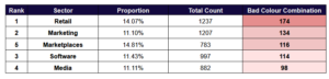
Retail leads the pack with 174 out of 1,237 startups (14.07%) using poor colour combinations. This is particularly striking given that retail depends so heavily on visual impact and consumer trust. Flashy palettes that sacrifice readability may grab short-term attention but could ultimately damage brand recall.
Even Marketing startups themselves place second, with over 11.1% (134 of 1,207) guilty of poor combinations. The irony here is hard to ignore: the very sector that sells expertise in communication and persuasion is failing at the most basic element of brand design.

Close behind are Marketplaces, where 14.81% of startups (116 out of 783) fall into the “bad palette” category: the highest proportion across all industries analysed. For businesses competing to be the “middleman” between buyers and sellers, unclear or chaotic branding may undermine credibility at a critical first-impression stage.
Why colour choices matter
Colour is more than aesthetics; it communicates emotion, signals meaning, and guides attention. Consider these associations commonly used in branding:
- Blue conveys trust, reliability, and calm: popular with tech companies.
- Red stimulates urgency and excitement: often used in retail and automotive.
- Yellow signals positivity and creativity, making it great for standing out on crowded shelves.
- Green evokes health, sustainability, and nature: ideal for food or wellness brands.
- Pink can be both playful and romantic, making it especially appealing to younger demographics.
When misused, colours not only look chaotic but also reduce readability, frustrate users, and hurt inclusivity.
Countries with the Most Problematic Startup Colours

The findings show clear regional differences in startup branding, with India leading, with 15.06% of startups (341 of 2,264) using poor colour combinations: the highest globally. Indonesia (13.84%) and Poland (13.04%) follow, showing that smaller countries can be just as prone to bad colour combinations when starting up.
Singapore (11.33%) and the UK (11.24%) rank fourth and fifth globally, with one in ten startups risking confusing or alienating customers through poor colour choices.